The Upper Deck Revolution
Something happened to baseball cards in 1989.
Well, it technically happened in 1988. But it was big. In fact, we’re feeling the reverberations of it to this day.
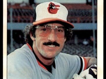
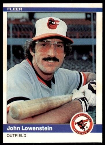
You see, in the 1980s baseball cards tended to look something like this:
The front of baseball cards tended to have somewhat thick borders that held the picture in place. There was usually a logo, or a small picture, or something else in one of the corners. Pictures were also generally pretty conservative, and, frankly, were usually pretty boring.
This is the pattern that Topps developed through its monopoly era. For most of the 1980s, this was the commonly accepted “correct” way to create baseball cards.
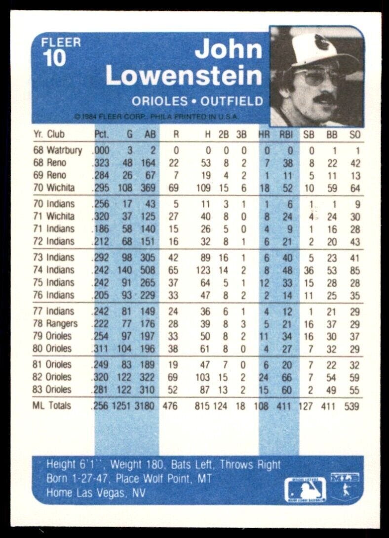
And the backs were usually something of a mess:
The backs of baseball cards have been an essential part of baseball culture for a number of decades now. As nice as this card back looks on the screen, in real life it’s kind of hard to see because of the small font size.
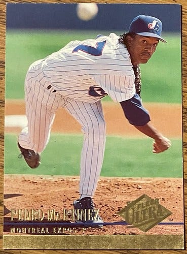
Fast forward a decade, and you’ll see this:
Note that the wood on the side is from the desk this photo was taken on. The card front of this “premium” card had lost its border by 1994. Pictures tended to be action photos instead of boring images of player faces. And then you had the gold coated printing and all the fancy stuff.
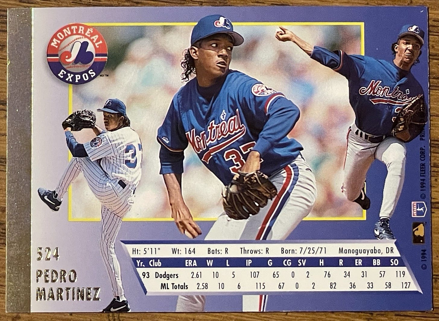
And here’s what Pedro’s back looks like:
We’ve got a really nice looking card back here — full color, numerous photos put together, gold foil stamping, and a much easier to read stat line.
So what happened? How did we get from point A to point B?
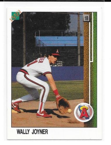
The big development was really Upper Deck’s entry into the market in 1989. And it technically started in 1988, when Upper Deck managed to print a few sample cards. For example, there was this sample Wally Joyner card:
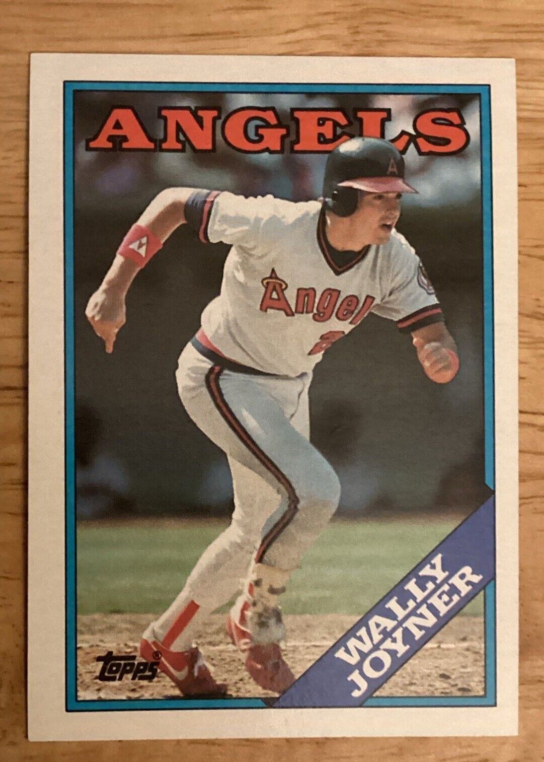
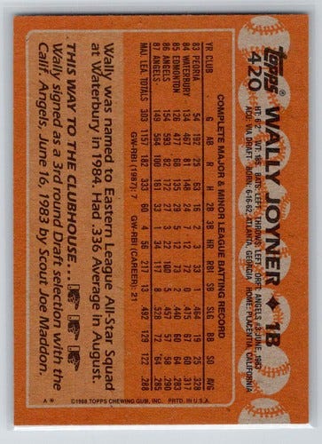
Now, if you just look at the front of the card, it’s not easy to see how this is a huge improvement from, say, the 1988 Topps Wally Joyner card:
It doesn’t necessarily show up in these images, but the truth is that the Topps card is a bit off-white and not quite as bright as the Upper Deck card.
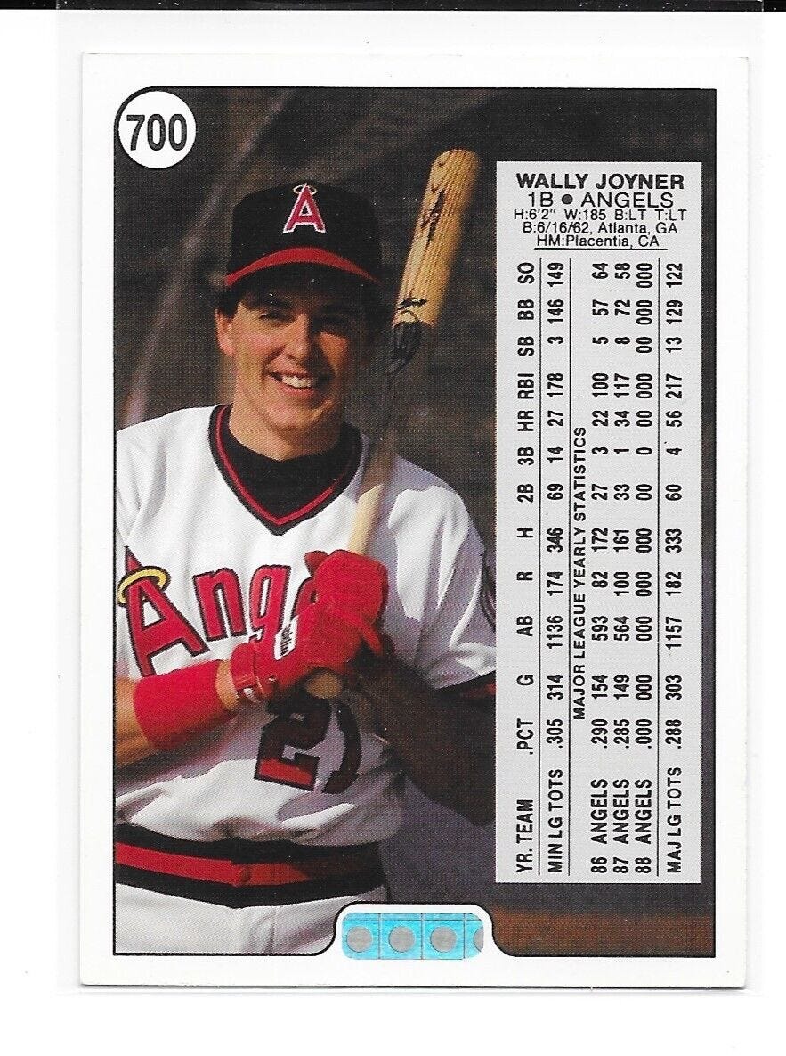
However, the backs are where you really see what Upper Deck brought to the industry:
The dots on the bottom were an early version of Upper Deck’s famous “hologram,” which theoretically was there to prevent counterfeits (in reality, it only slowed down counterfeiters a bit). But the real key here is just how good that card back looks in comparison to the Topps back:
The Topps backs from this era in particular drive me nuts. They’re monotone, difficult to read, and overall really boring.
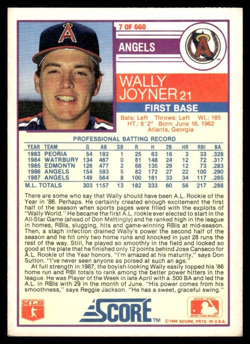
Perhaps 1988 Score makes for a better comparison:
Even with the color, though, the back still isn’t as striking as the Upper deck version, and is a lot less exciting than that 1994 Fleer Ultra back. It’s not boring, sure, but two whole paragraphs of description seems like quite a bit.
Upper Deck achieved this by making a few major changes:
Upper Deck focused on using high quality glossy paper (as opposed to the generic cardboard Topps was using)
Upper Deck focused on using advanced color separation processes when printing the cards
Upper Deck’s design focused more on catching the eye than simply presenting information — something that was a big break with how the industry had worked up to that time.
1989 Upper Deck was revolutionary in this way. It wasn’t long before Topps launched its Stadium Club brand to create “premium” cards to compete directly with Upper Deck — and the rest is history.
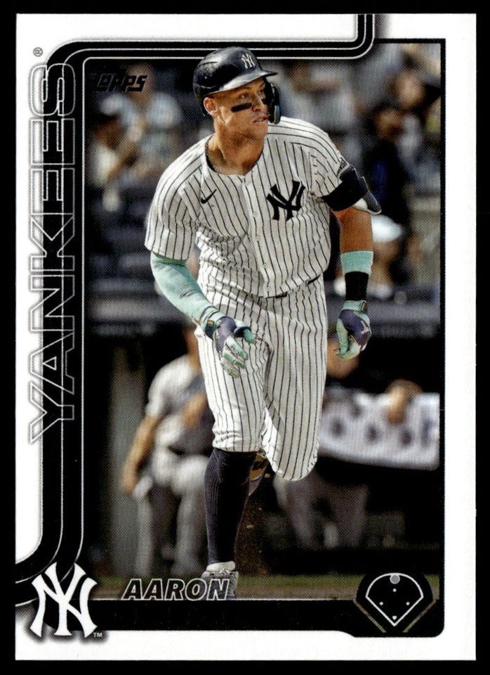
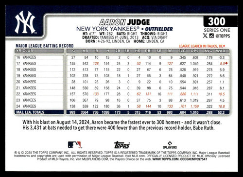
You can see the impact Upper Deck had if you look at a random 2025 Topps base card:
Of course, some of these changes — the clear design, the easy to read back, the fonts, and so on — likely would have come no matter what thanks to advancements in technology. But you can still see some of the Upper Deck effect shine through.



I kind of lost interest in baseball cards around the time Upper Deck came out. In part maybe due to time in my life but also was just more a fan of the classic look of baseball cards. As a kid I got baseball cards at the grocery store or 7-11 and they pretty much had TOPPS, so I had no idea there were other brands until I went to a card shop for the first time.