

Why Replay Failed

First of all — you should know that Replay Baseball is alive and well. In fact, I think the game is healthier than it has ever been.
However, it wasn’t always like this. In fact, Replay essentially went out of business after the company printed the 1990 season.
This is puzzling to me for a number of reasons. One, as you already know, is that I really think the “classic” Replay Baseball game was excellent. It seemed to address every single issue that fans of both APBA and Strat-O-Matic had with their game engines. It’s also very easy to play and plays very quickly.
Plus, Replay went out of business at a time that these games were actually doing better than ever. It’s not the 1994 strike that caused Replay to go under.
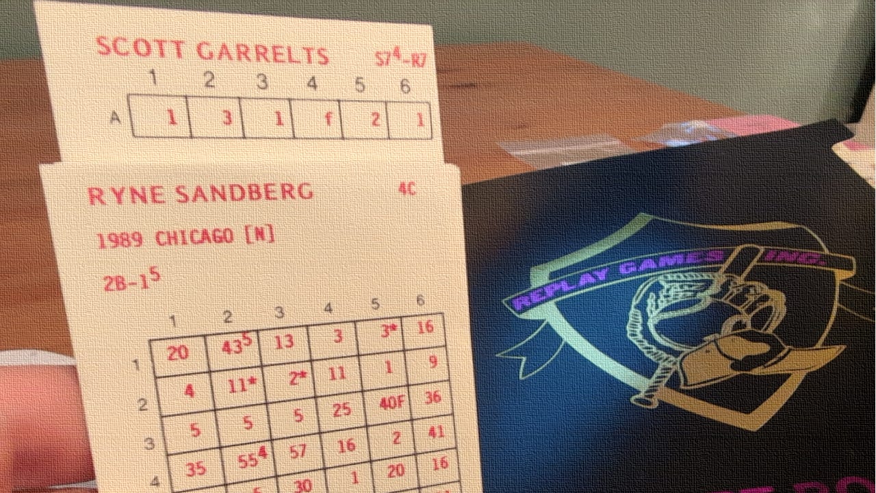
I’ve played the old version of Replay, and can assure you that it’s a great game. The cards look just fine:

The game flows well, and it’s easy to play a game in under a half hour once you know what things mean.
I honestly think the problem was the advertising.
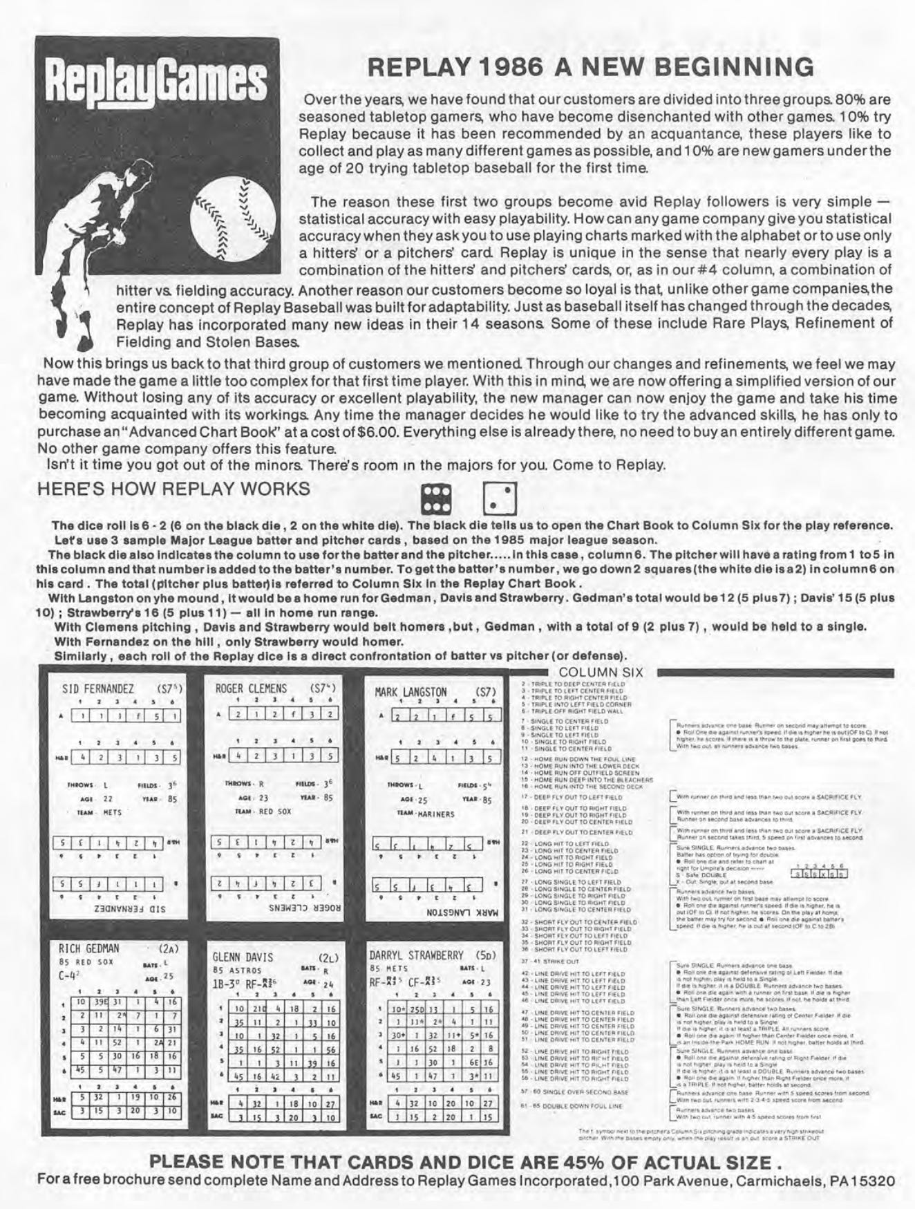
Look at this advertisement, for example. This comes from the 1986 edition of Street and Smith’s Baseball Yearbook:

All I see are words, words, words.
Look — the big selling point for Replay was the way that pitchers and hitters interacted on all dice rolls (with the exception of column 4, where it’s between an infielder and the hitter). That ends up being point number 4, hidden in the advertisement.
Replay’s 6 points are:
We’ve been making this game for 10 years and we change things.
We give you more players.
We have a good stolen base and fielding system.
Results are generated from both pitcher and hitter cards together.
We have good card stock.
We have past seasons.
What I don’t undestand is why they didn’t simplify those points to something like this:
Results are generated from both pitcher and hitter cards together.
Our system is easier than other games.
And that’s it.
Sure, Replay had good card stock. No, the cards weren’t more attractive than APBA or Strat cards. Strat, of course, went to the flimsy card stock a few years after this.
However, Replay decided for whatever reason not to even show any cards in its advertisement. And that part I don’t understand.
Why couldn’t they use a picture like this?
It took me a few takes to get this right for a YouTube thumbnail, but it really wasn’t that compliated. You can see here the unique Replay system: the fact that the pitcher and hitter cards interact on every dice roll.
Now, Replay’s 10 years of experience didn’t make much of a difference. By 1986, APBA had been in business for 35 years; Strat had been making cards for 25.
Giving gamers more players would absolutely appeal to the hardcore season replay crowd, sure. But most of those players are marginal. In fact, you could make a good argument that using generic ratings would actually be more accurate than using ratings generated from extremely small sample sizes.
The stolen base and fielding systems are great, absolutely. But the nice thing about Replay is that every system works the same way, more or less. You see the rating, roll one die, and either look for a result higher or lower than the rating. Once you’ve learned it once, you’ll never forget it.
Replay apparently did offer more past seasons at that time than APBA, though I’m really not sure this was a great selling point. APBA’s past seasons were famously inaccurate, and I’ve also heard rumors that the Classic Replay past seasons suffered from some arbitrary ratings that might have been quite controversial.
Anyway, Replay’s ad couldn’t compare with ads like this:

Or this:

Replay did try to do better with its 1987 advertisement:
However, this feels cluttered and wordy, once again. Why not just show one pitcher and one hitter? Why show the entire pitcher’s card? Why show the entire column six page?
Not long after all this, Instant Replay reported that the company was trying to create a simplified version of its game and chart book, presumably to find younger players. I’ll never understand why, since the game was just fine as it was.
Anyway, let me know what you think.
Image is everything, especially to a kid. What turned me off to APBA from the baseball yearly's was the cards lacking statistics and results I could identify with. This is something SOM had. Pursue the Pennant stood out as well with ballpark inserts and color. You should have written the ad, way too much print like you mentioned.
I agree, advertising is everything. In the early 70s Sports Illustrated produced a tabletop baseball game, with truly exciting ads in the magazine describing how “You can be the manager!” My mom listened to my pleas and ordered it.
It was a great, 3 specialty dice game. There were beautiful 30-outcome colored charts for each team (batters vs. LHP and vs. RHP on front, pitchers and pitchers batting on back) green for hits, red for outs, blue for strikeouts, yellow for walks. And the topper, a couple paragraphs of journalism on back below the pitchers charts entitled, “Sports Illustrated Analysis.” I memorized each team’s. (“Who said there are no more wooden Indians? Just look at the 1971 version in Cleveland. At least Ken Harrelson was driving balls 600 feet… after he quit baseball and joined the PGA Tour…”)
In addition to the ‘71 season, the game created magnificent “All Time All Star” charts for each franchise (ex./ Philadelphia/Kansas City/Oakland Athletics). You could compare Mantle, Maris, Ruth, Combs, et. al’s 30 outcomes right there on the same page, and factor in their fielding ability for decisions on starting lineups.
But then for the 1972 season Sports Illustrated converted to lifeless small individual player cards with no coloring at all, and needless to say no journalism. APBA cards were a veritable parade of colors in comparison. Oh well, it was a brief glorious run. It provided multiple entertaining All Time All Star tournaments for me through the years.